Bagisto Forum

    Bagisto

    • Register
    • Login
    • Search
    • Categories
    • Recent
    • Tags
    • Popular
    • Users
    • Groups

    Velocity theme layout not responsive

    Bug Report
    5
    15
    1106
    Loading More Posts
    • Oldest to Newest
    • Newest to Oldest
    • Most Votes
    Reply
    • Reply as topic
    Log in to reply
    This topic has been deleted. Only users with topic management privileges can see it.
    • _
      _developer_12 last edited by

      As we are checking, we got an issue that for firefox bowser following vue.js command not working:

      v-if="!isMobile()"

      This condition in the following file
      Webkul\Velocity\src\Resources\views\shop\layouts\header\index.php

      when we open site on mobile then mobile views are NOT loading (dektop views are loading) thus this issue are coming.

      Please suggest how to fix this issue ASAP.

      1 Reply Last reply Reply Quote 0
      • V
        Vaishali Agarwal last edited by

        @_developer_12
        Thanks for your efforts!
        could you please reload the page again when you open the website in responsive.
        As we are not getting this issue in firefox.

        Screenshot_17.png

        1 Reply Last reply Reply Quote 0
        • _
          _developer_12 last edited by

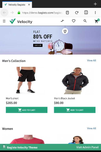
          @_developer_12 said in Velocity theme layout not responsive:

          v-if="!isMobile()"

          It's fine only in chrome browser. Please check in firfox, safari etc.

          1 Reply Last reply Reply Quote 0
          • _
            _developer_12 last edited by

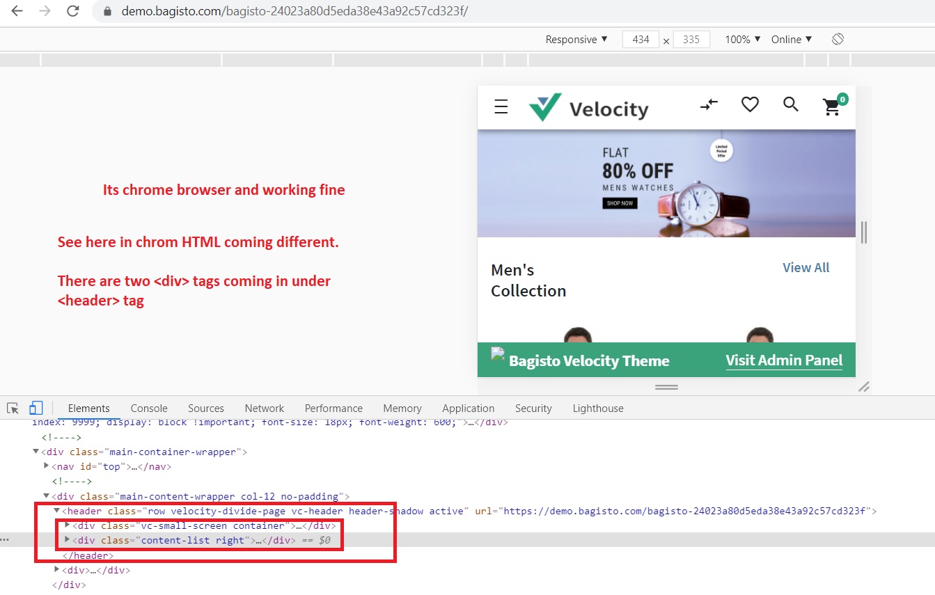
            You can check in firfox bowser by "inspect element", you will get different view HTML in chrom and firfox browser.

            It seems v-if="!isMobile()" not working in firefox, is it something make sense?

            1 Reply Last reply Reply Quote 0
            • T
              tluanga last edited by

              here's firefox view. ? not responsive here how can i fix this?
              5f13ea57-26e7-489f-8481-42dbaa82ded9-image.png

              1 Reply Last reply Reply Quote 0
              • devansh-webkul
                devansh-webkul last edited by devansh-webkul

                Hi @_developer_12 ,

                Just refresh the page one more time when switching to mobile view in browser to render the settings properly.

                1 Reply Last reply Reply Quote 0
                • _
                  _developer_12 last edited by

                  Your shared screen shot is seems from chrom browser not from firefox.

                  Please review in firefox and suggest how to fix the issue.

                  Please, I am in trouble.

                  1 Reply Last reply Reply Quote 0
                  • devansh-webkul
                    devansh-webkul last edited by

                    Hi @_developer_12

                    I have tested this in both platform Mozilla as well as Chrome and it's working fine. Just refresh the page one more time to get the view proper.

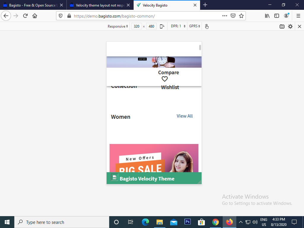
                    I referring to the same Bagisto Demo app in Mozilla,
                    Screenshot from 2020-08-13 18-55-30.png

                    In Chrome,
                    Screenshot from 2020-08-13 18-59-32.png

                    1 Reply Last reply Reply Quote 0
                    • _
                      _developer_12 last edited by

                      I have check lots of time this thing in the firefox browser after refreshing in mobile size.

                      And I have also checked in multiple PCs as well and you can found in the same link user @tluanga post the same thing.

                      So issue is there. For explaining more I am sharing code difference which is coming in different browsers for demo bagisto. Please review the following images for chrome and firefox. you will get clear both browsers showing differnt HTML code.

                      chrome.jpg FF.jpg

                      1 Reply Last reply Reply Quote 0
                      • V
                        Vaishali Agarwal last edited by Vaishali Agarwal

                        @_developer_12
                        Thanks for confirming the bug at your side.
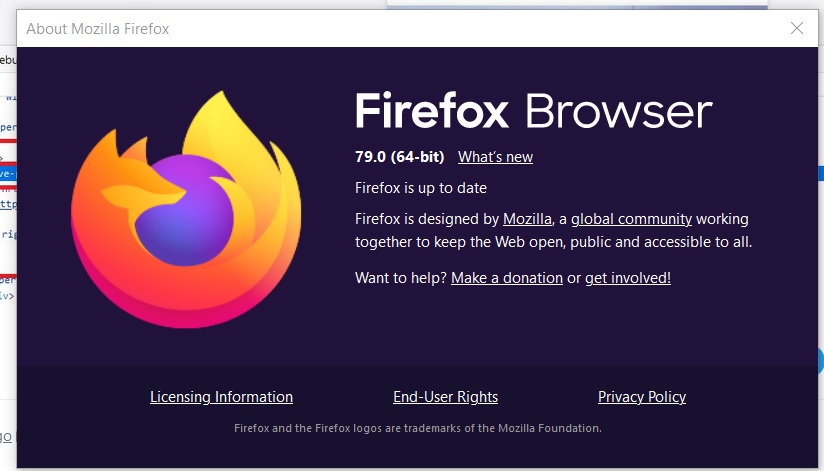
                        could you please mention your firefox browser version?? It will be really helpful for us to cross-check the bug.

                        1 Reply Last reply Reply Quote 0
                        • _
                          _developer_12 last edited by

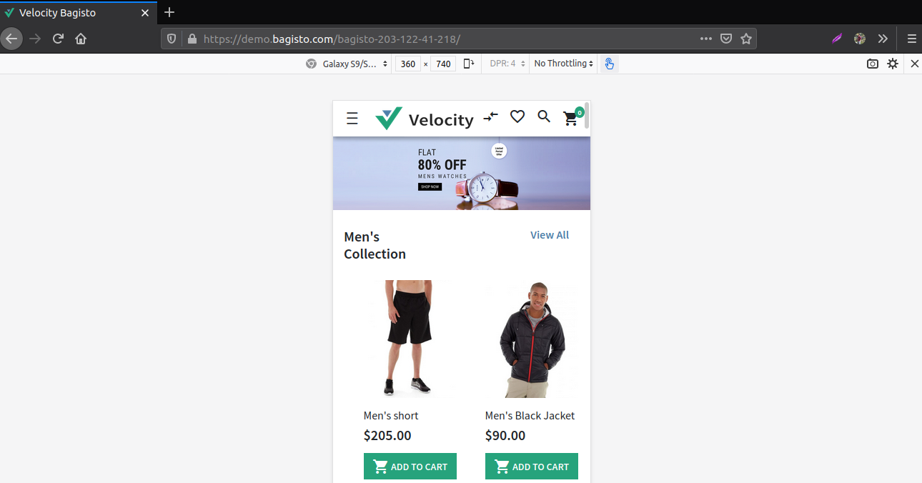
                          Its updated upto date. Please review following image.

                          FFver.jpg

                          1 Reply Last reply Reply Quote 0
                          • devansh-webkul
                            devansh-webkul last edited by devansh-webkul

                            Hi @_developer_12 ,

                            I have added a check for Mozilla as given in their documentation.

                            Please take a look on this pull request,
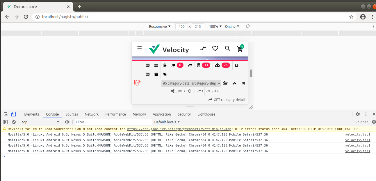
                            https://github.com/bagisto/bagisto/pull/3758.

                            Note: If you want to test the mobile in Mozilla you need to activate the user agent by selecting mobile device from the dropdown as in responsive case it will give web agent but if you check chrome it by default give mobile user agent.

                            In chrome by default all user agent are comming,
                            Screenshot from 2020-08-14 12-55-08.png

                            In Mozilla only web user agent is coming,
                            Screenshot from 2020-08-14 12-58-21.png

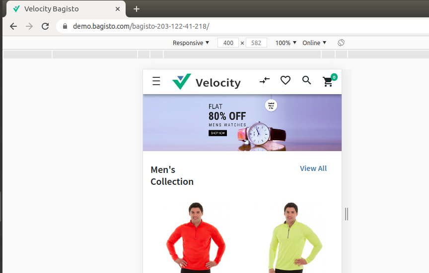
                            But see when i change the user agent to GalaxyS9 in mozilla,
                            Screenshot from 2020-08-14 13-01-22.png

                            Please check and let me know.

                            1 Reply Last reply Reply Quote 0
                            • First post
                              Last post