Product Card redesign
-
Hi everyone,
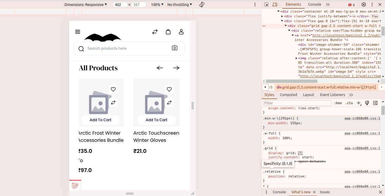
I'm currently working on redesigning the product card layout for the mobile view of our website. I want to display two product cards side by side on the front page, ensuring that the design remains clean, user-friendly, and visually appealing.


-
Hello @haseebkamboh
Greetings of the day..!!
If you want to show 2 products in mobile view kindly go to packages >> Webkul >> Shop >> src >> Resources >> views >> components >> products >> carousel.blade.php this file and make your changes set minimum width and height accordingly.
Frontend
Thanks & Regards..!!
-
@Rishabh-Webkul
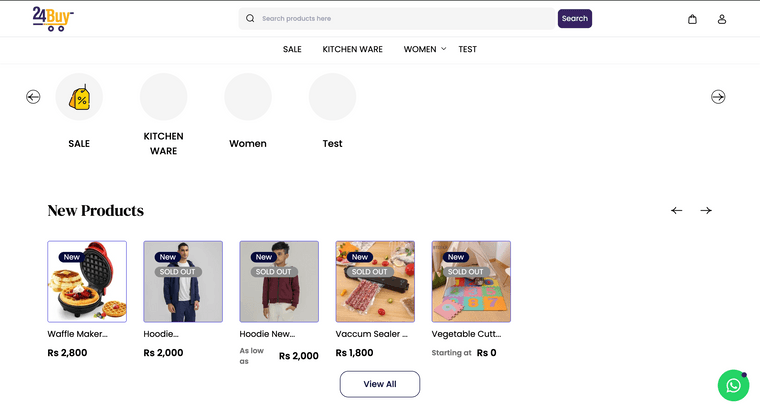
I've been working on customizing the product card layout for the mobile view in Bagisto. My goal is to display two product cards side by side on smaller screens while maintaining an appropriate size for desktop screens.I attempted to adjust the minimum width of the product cards by changing the class from min-w-[291px] to min-w-[281px]. However, this change affected the card sizes for both desktop and mobile views in unexpected ways, causing layout issues and making the design cluttered and difficult to manage.
Despite following the recommended approach of modifying the file located at packages/Webkul/Shop/src/Resources/views/components/products/carousel.blade.php, the adjustments did not yield the desired results.
I'm finding it challenging to customize the layout effectively within Bagisto’s structure. Could anyone provide guidance on why these changes might be causing such issues and suggest a more reliable method to achieve the desired responsive design? Additionally, any tips on simplifying the customization process within Bagisto would be greatly appreciated.
Thank you!

-
@Rishabh-Webkul
Waiting for your response. thanks -
Hello @haseebkamboh
Greetings of the day..!!
To make it compatible and responsive with the mobile and desktop view then for this, you have to write media query in this file.
Thanks & Regards..!!
-
Hi bro, I have a question: how can I make the product card not square but horizontal, like a rectangle, with the photo displayed on the left and the information on the right, and so that the cards themselves are displayed vertically?
